MDMFA Thesis Project
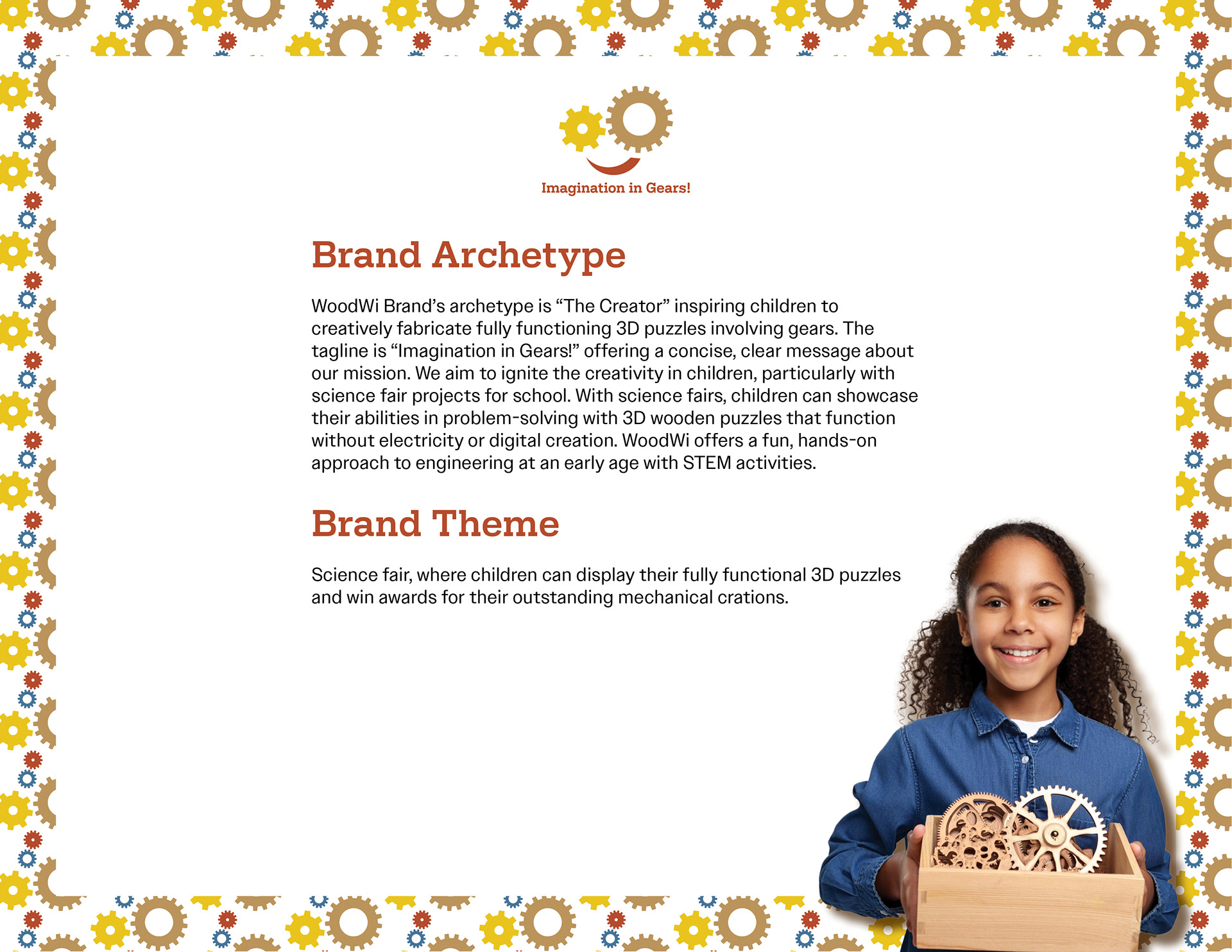
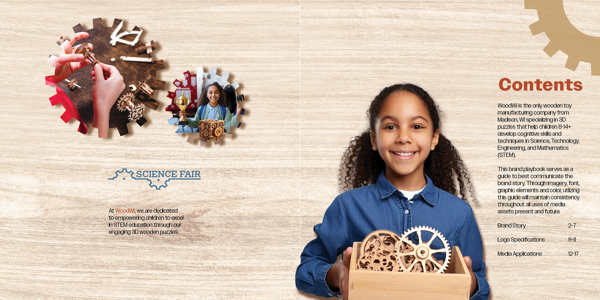
The service I chose for my thesis is a small wooden toy company in Madison, WI, preparing for national expansion. It targets children and teens aged 8 to 14+, focusing on those interested in developing STEM skills through engaging in mechanical projects.
The product range includes beginner to advanced 3D puzzles made from laser-cut wood. These toys promote creativity and critical thinking, providing a sense of understanding and fostering cognitive development for aspiring young engineers.
I chose the name "WoodWi" for the toy company, blending Wisconsin and wooden toys. It’s playful and easy to say, appealing to children and teens. The goal is to engage them while promoting early mechanical engineering skills through fun puzzles.
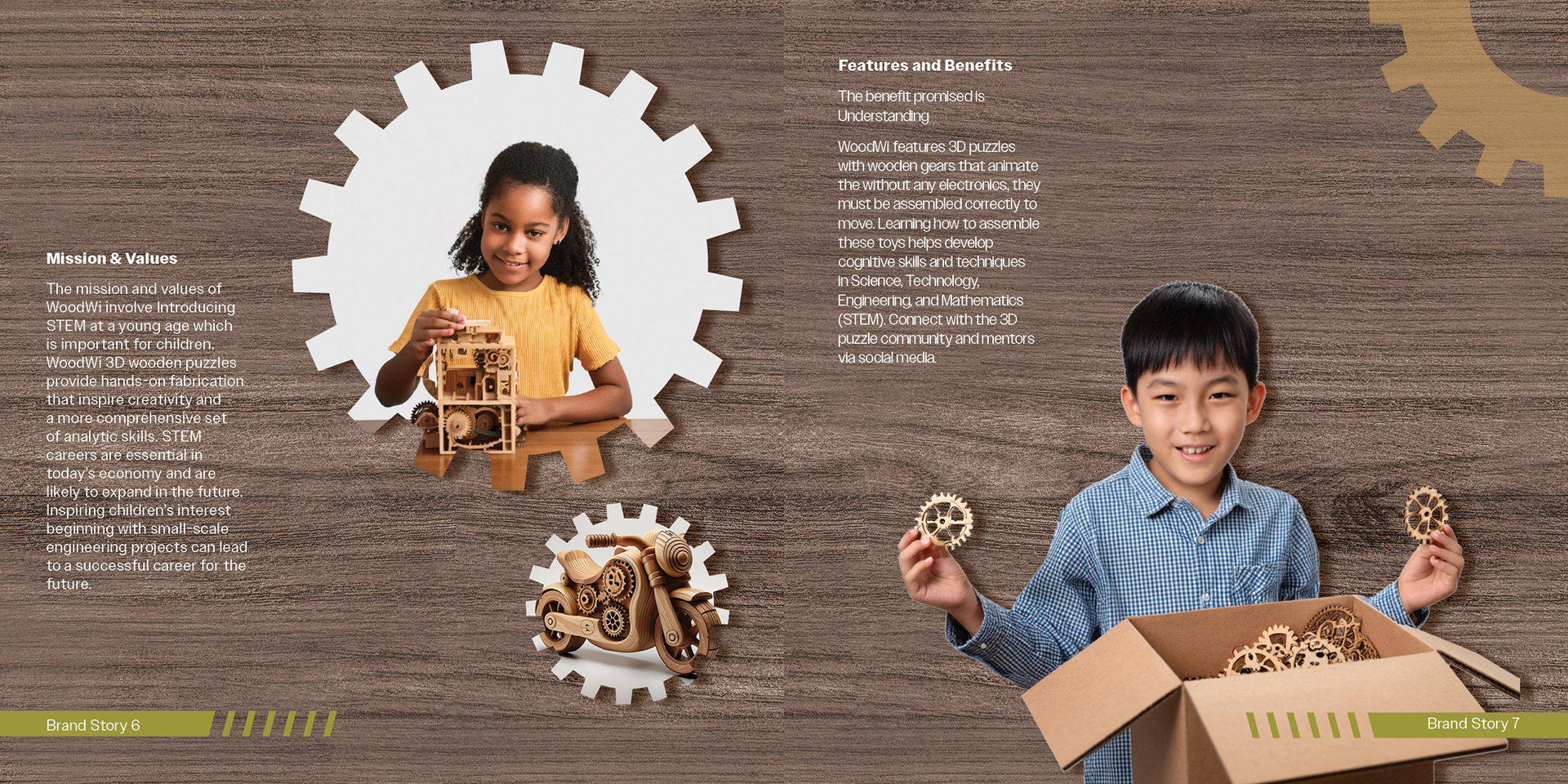
What benefit is being promised? Understanding
To whom is it being promised? Children and teenagers ages 8 -14+ interested in early engineering skills.
Why should they believe you? Wooden gears drive the 3D puzzles without electronics; they must be assembled correctly to function. Building these toys fosters cognitive skills and techniques in Science, Technology, Engineering, and Mathematics (STEM).
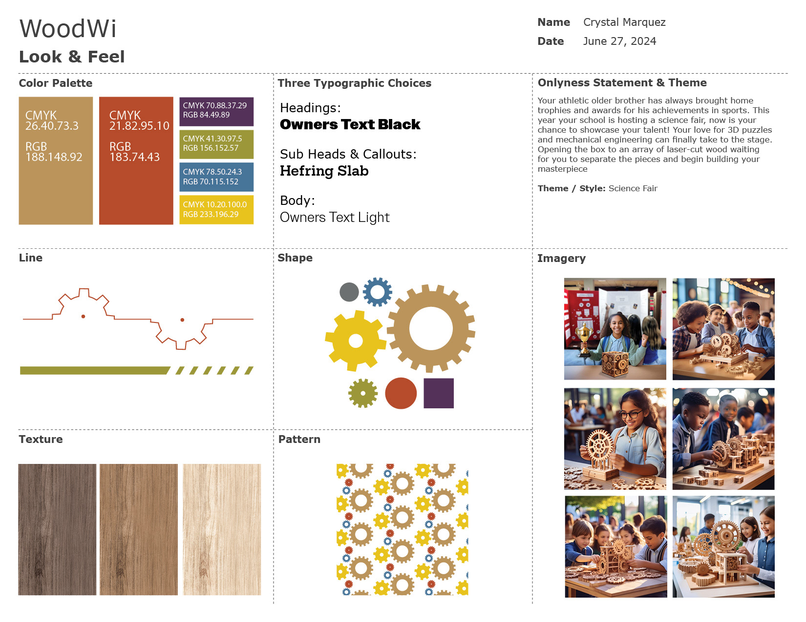
Theme / Style: Science Fair
Brand Personality is / isn't
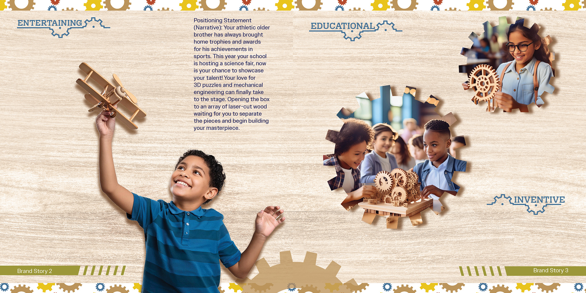
1. Is Inventive Isn’t electronic
2. Is Entertaining Isn’t Shocking
3. Is Educational Isn’t Scholarly
2. Is Entertaining Isn’t Shocking
3. Is Educational Isn’t Scholarly
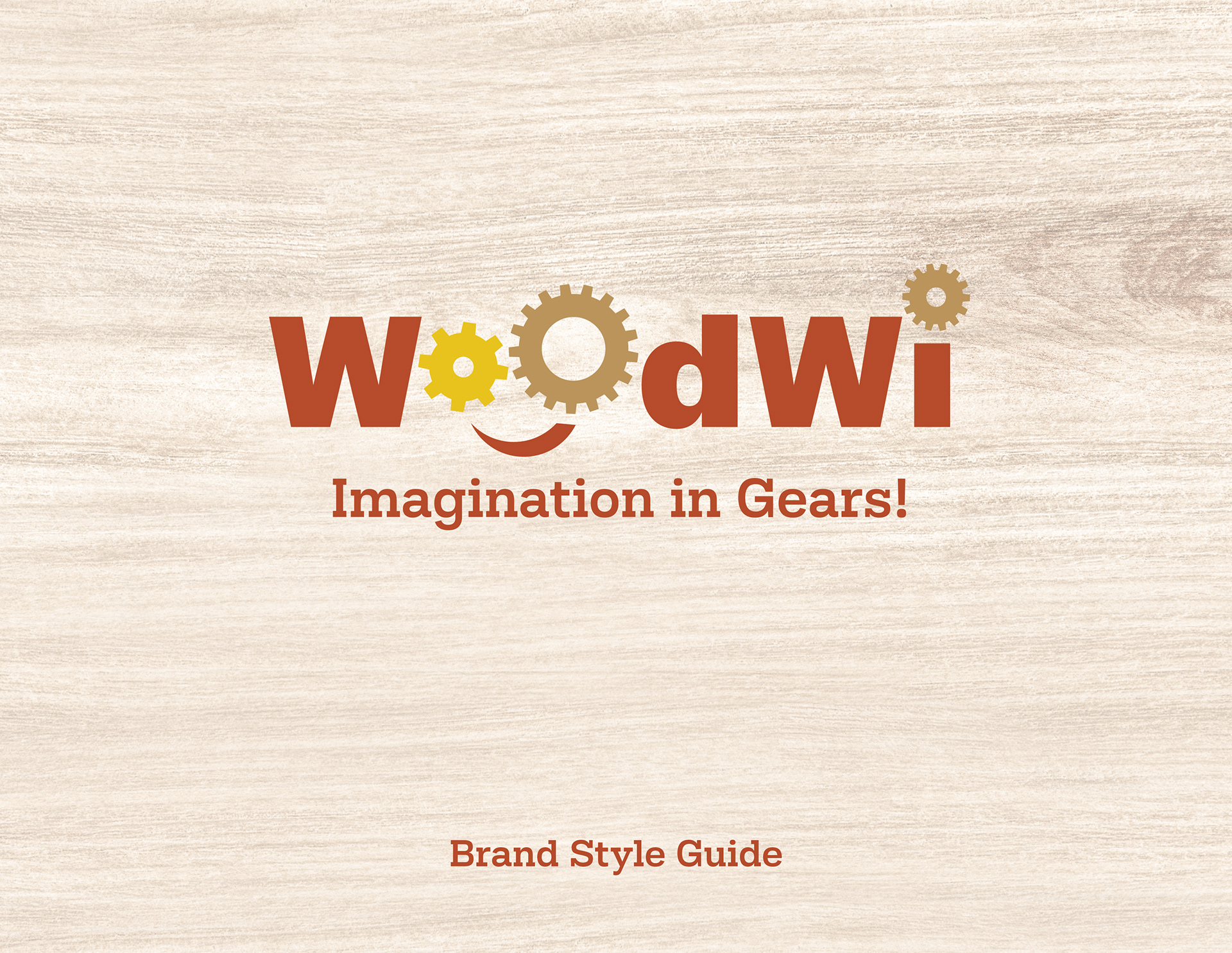
Tagline:
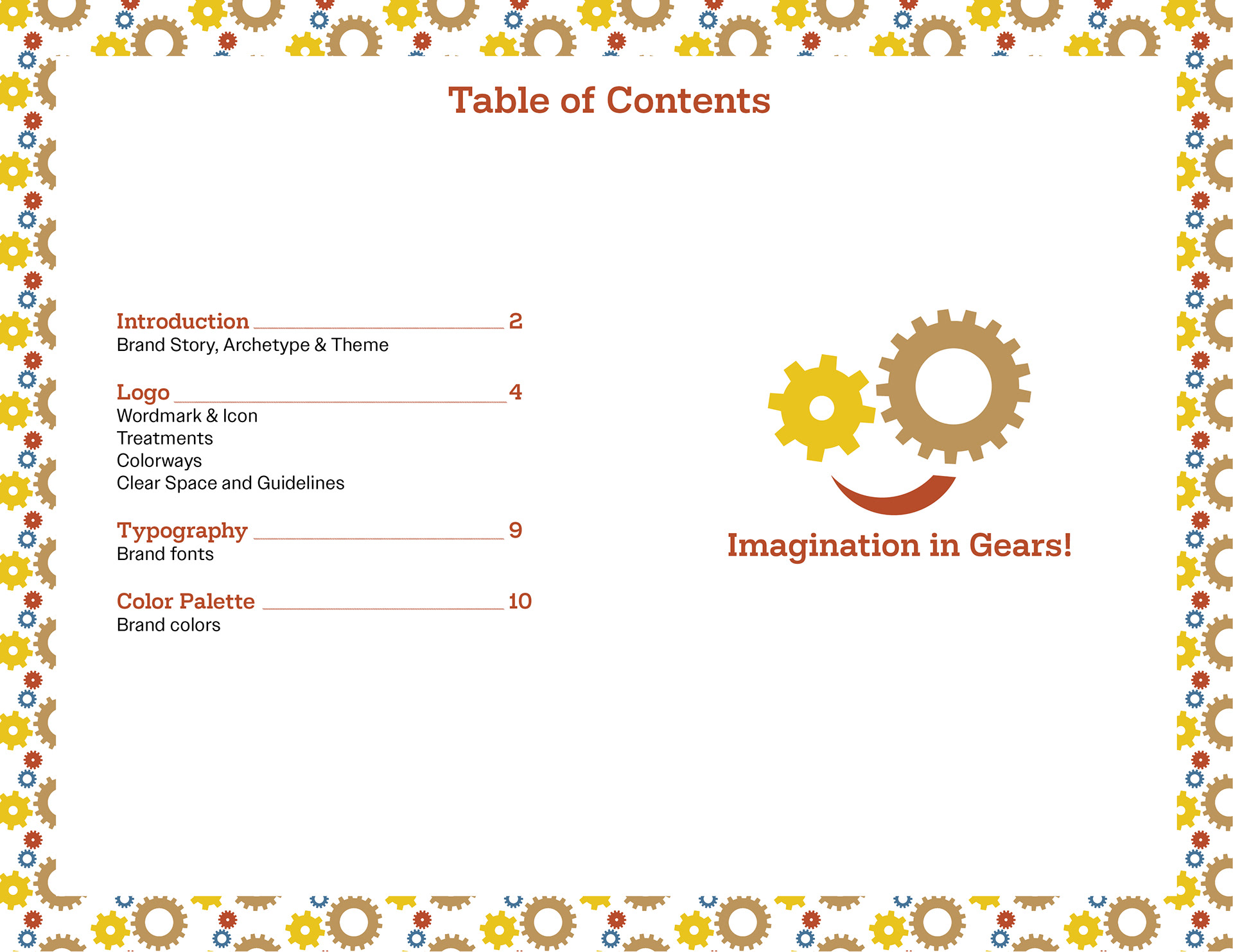
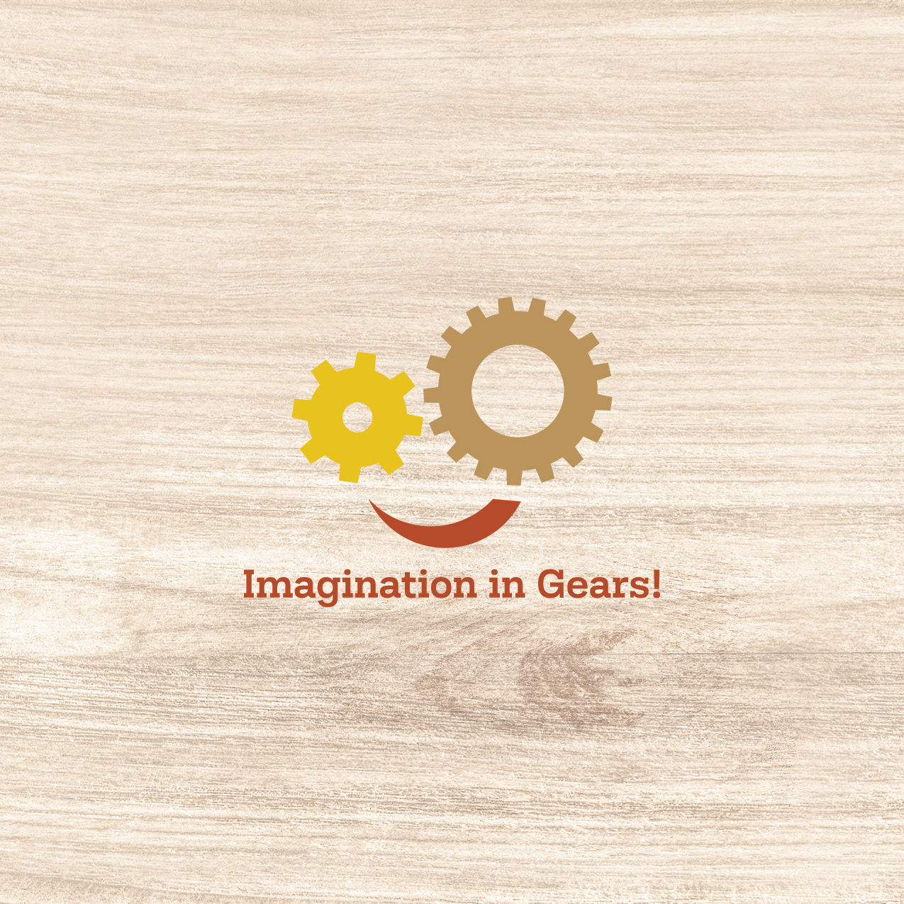
Imagination in Gears!
Brand Look & Feel
MarquezC-look_and_feel
Vision Board

MarquezC-Vision-Board
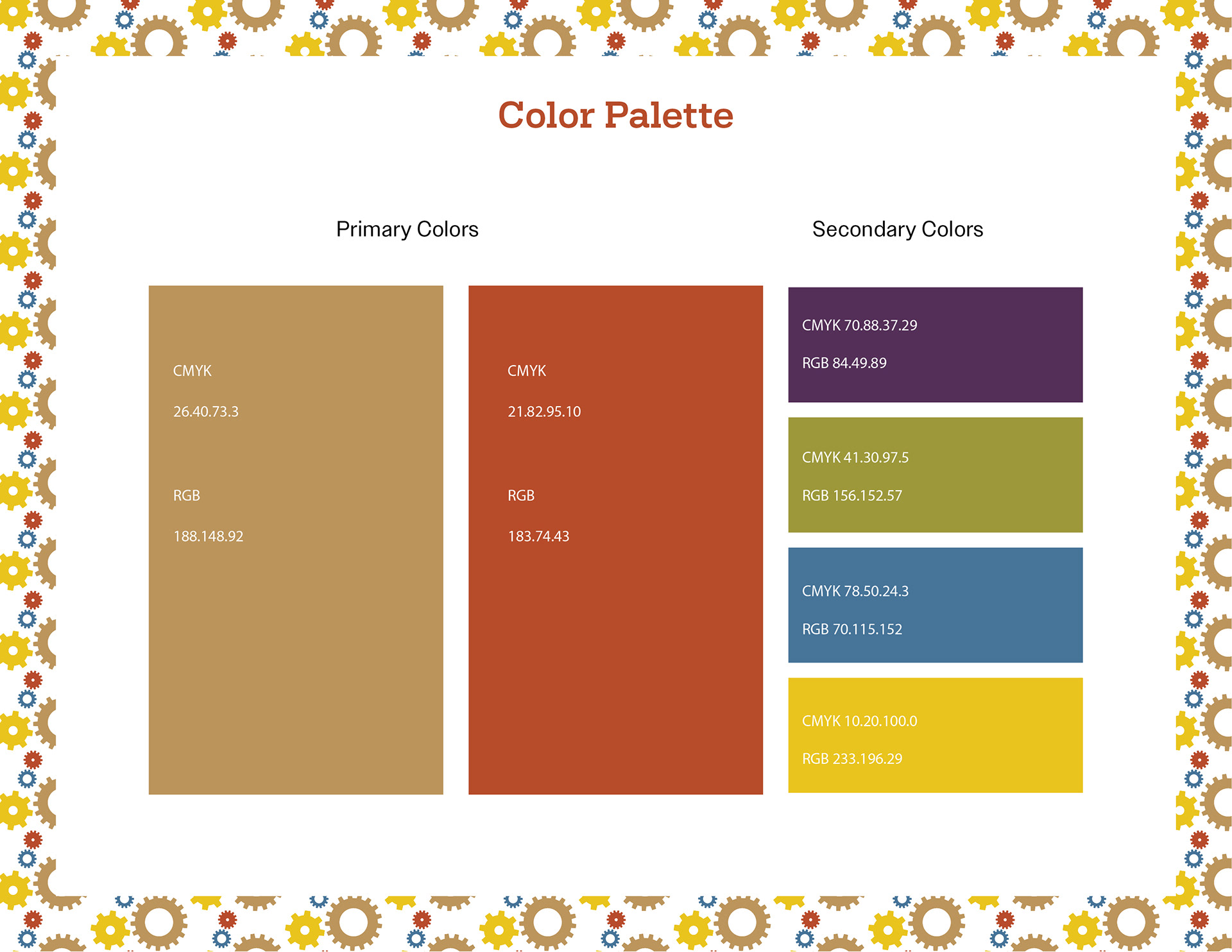
Color Palette
The color palette creates an effective learning environment, using greens, blues, and mauves to promote creativity and reduce anxiety, while oranges and yellows boost energy. Light brown and burnt umber reflect creativity and engagement, supporting the science fair theme. This scheme, informed by color theory, includes secondary colors that enhance mood. Overall, it effectively engages the audience and emphasizes understanding through activities like 3D puzzles in STEM labs.
Line Quality
Lines are essential in graphic design, setting the tone and guiding the audience's eye. For the “WoodWi” brand, which features 3D puzzles made of gears, thin gear-shaped lines reflect the benefit of understanding. The separations in the line element are mathematically correct, reflecting the features of the brand. These lines will create a cohesive look across media, highlighting the product's features and enhancing the core message.
Imagery
Imagery is essential for communicating a product’s benefits. For WoodWi, images of children building 3D puzzles for a science fair will use primary and secondary colors for consistency. This imagery should resonate with the audience’s interests, fostering a sense of connection and belonging. Understanding their needs through research will enhance design effectiveness.
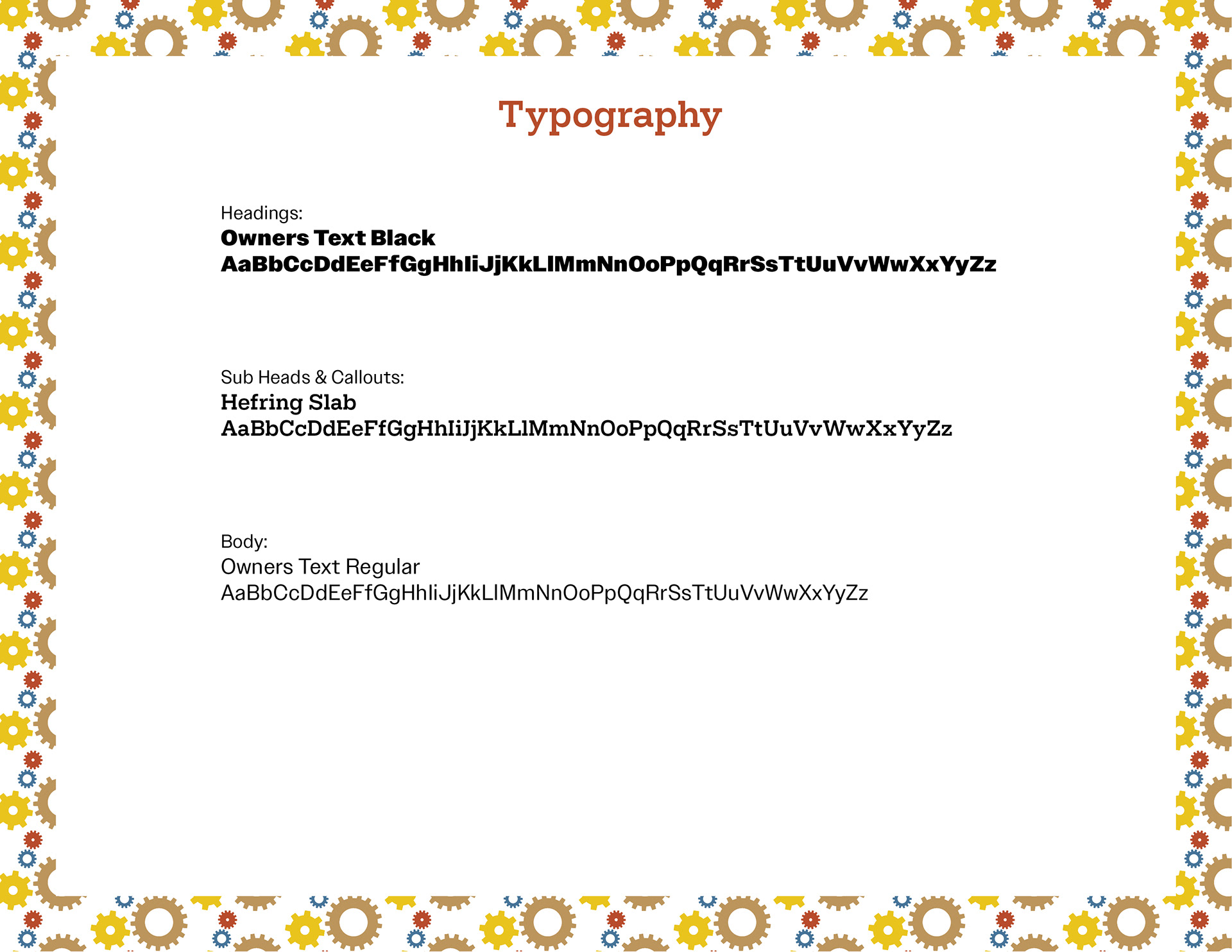
Typographic Choices
When I combined two typefaces with the same x-height—one slab serif and the other sans serif—I realized how well they complement each other.
This technique showcases the value of using a font family, as it creates a cohesive and comfortable reading experience. The headline, subhead, and body text work together seamlessly, enhancing communication without distraction.
Using a font family within a brand effectively conveys the intended message and has proven successful in design and publication.
Thumbnail Sketches
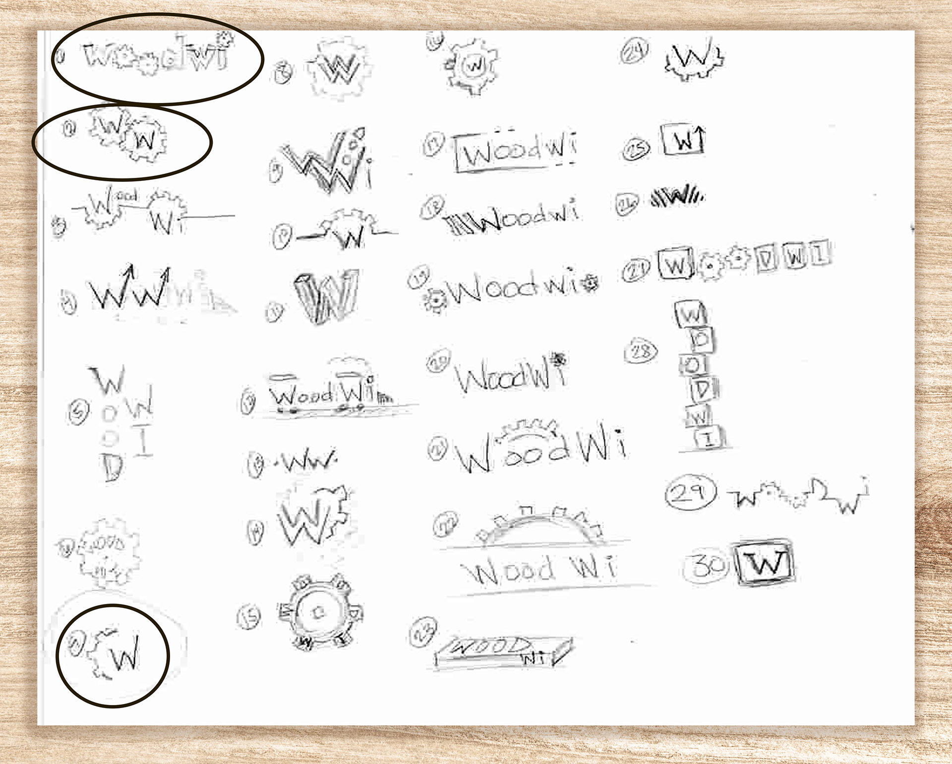
Logo Concepts
I began my thumbnail sketches by revisiting the vision board for WoodWi. To align with the tagline, “Imagination in Gears!”, I decided to include gear icons. While I considered incorporating wooden toys like a train, I realized that the science fair theme didn’t quite fit. However, building a wooden train could demonstrate STEM skills, relevant for a science fair.
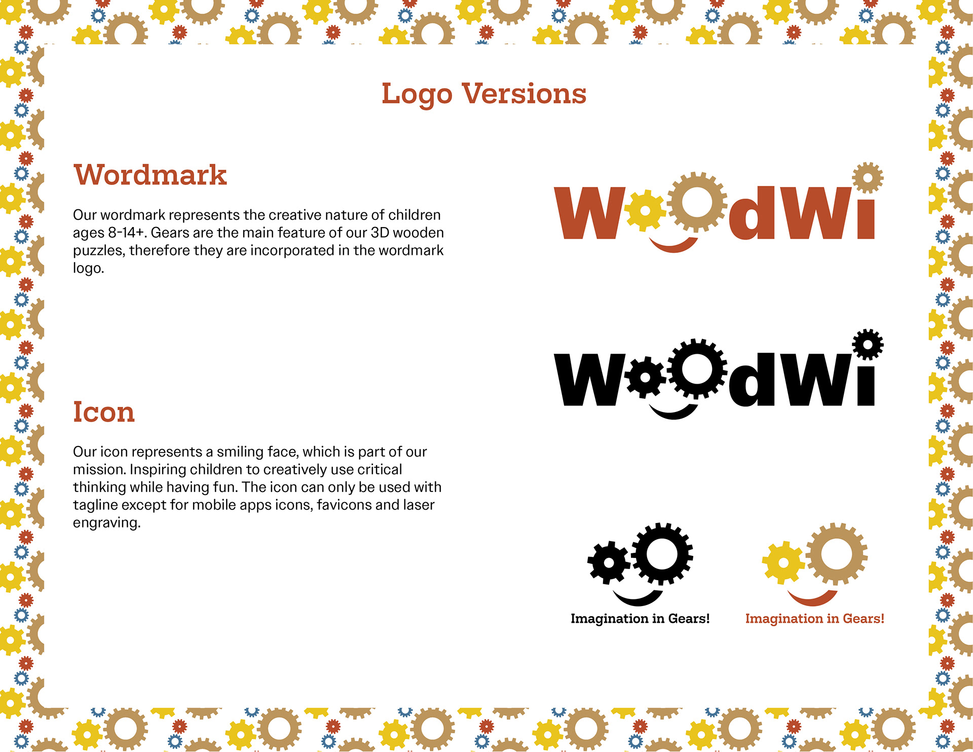
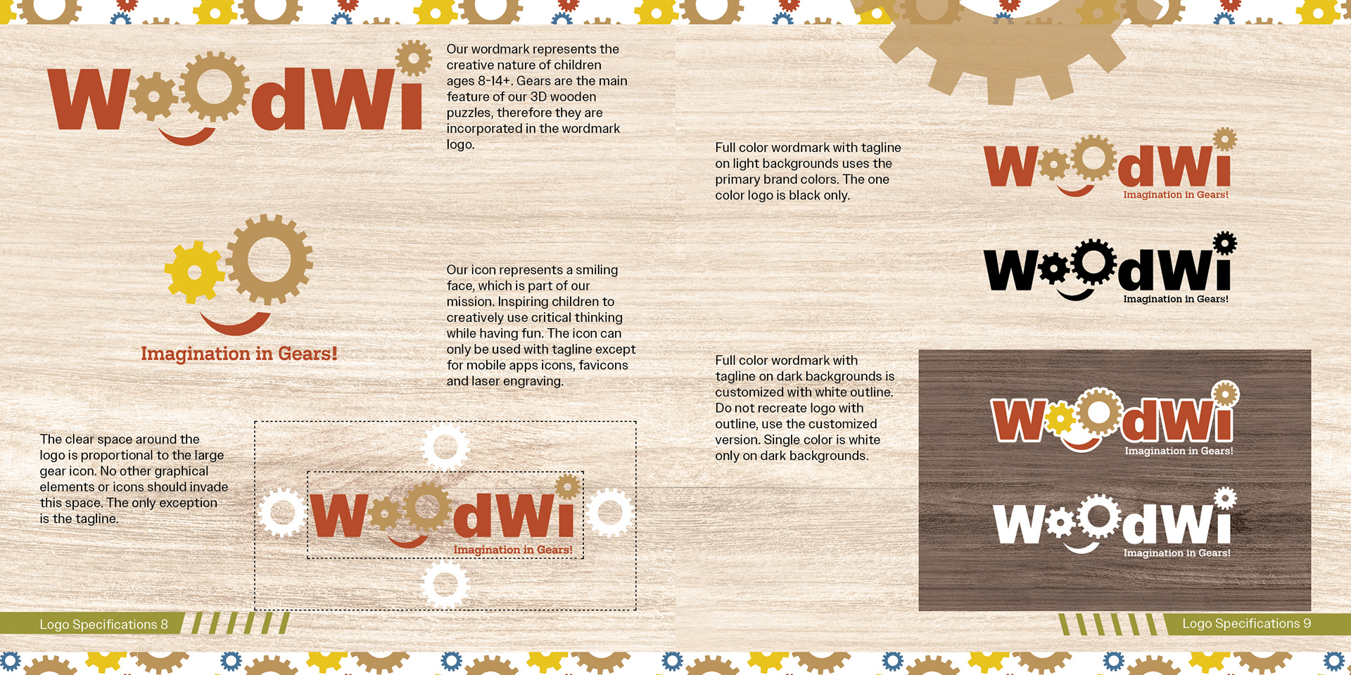
The first thumbnail represents the original brand concept, featuring gear symbols in the "o's" of "WoodWi" to connect the logo with its STEM-focused product.
The second thumbnail simplifies this with "W" initials inside gear icons for easy recognition across media.
The third thumbnail incorporates a gear icon with the "W," emphasizing the brand's focus on building functional wooden models for children aged 8-14+ as part of its identity.
Final Logo
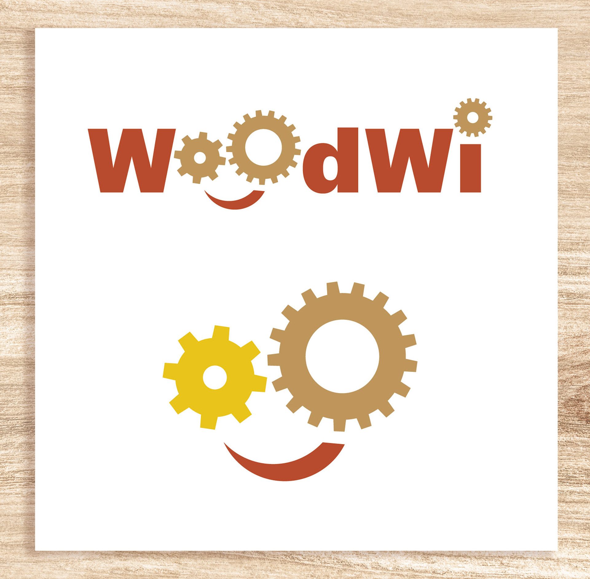
The two chosen designs are simple and appealing to children ages 8-14+ interested in STEM.
The first design features a wordmark with gear icons, while the second illustrates a smiling face, promoting imagination. The tagline "Imagination in Gears" emphasizes the product's focus on functional gears for building moving toys, inspiring creativity in the audience.
Brand Style Guide

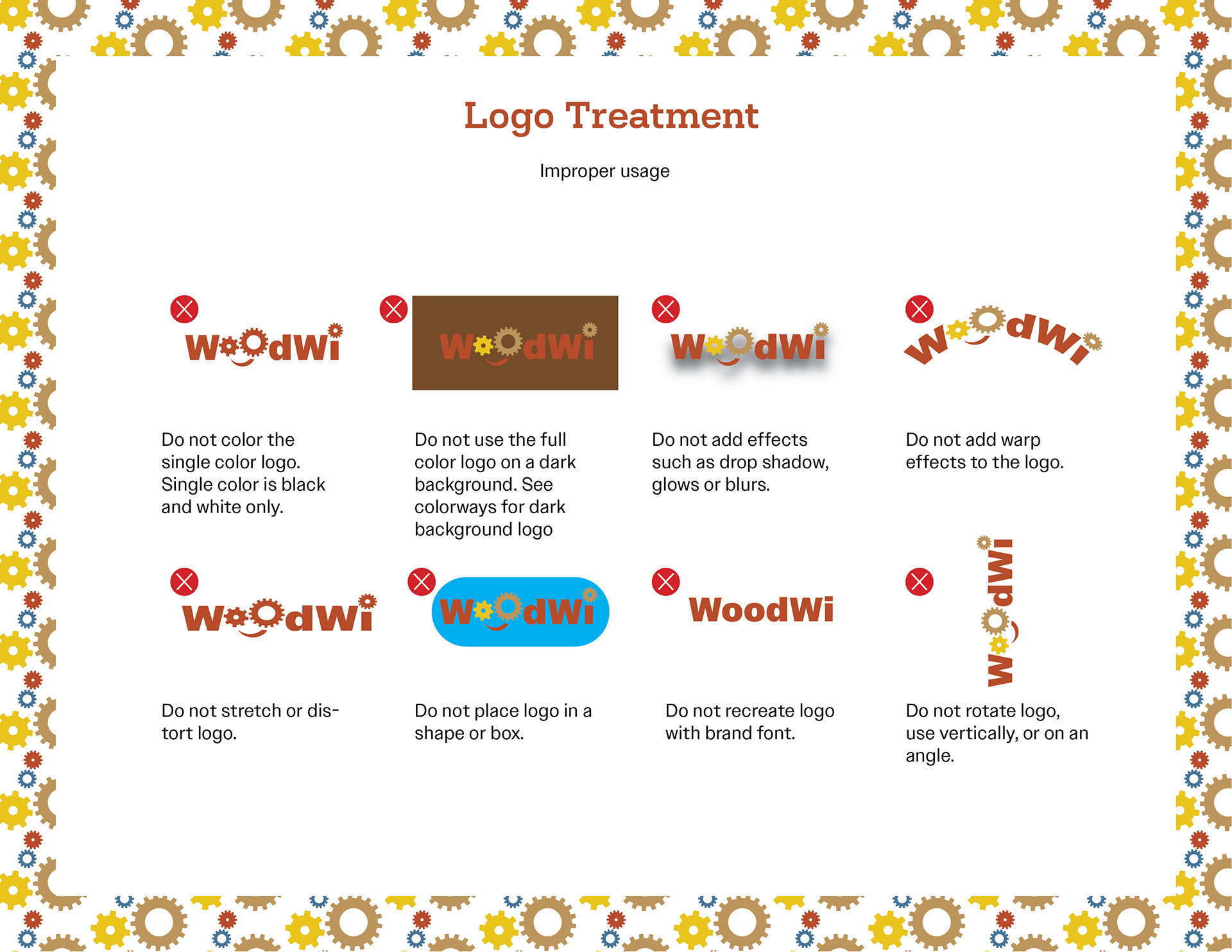
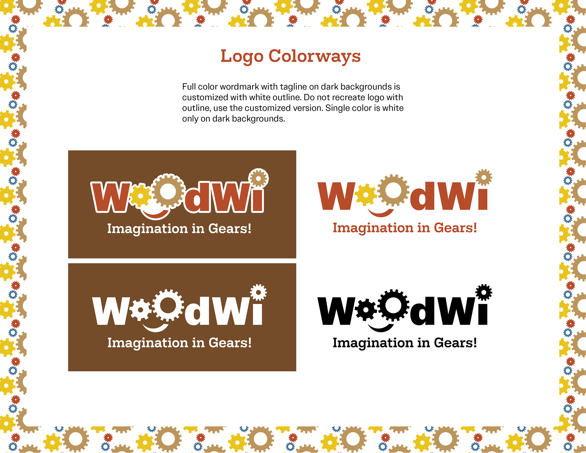
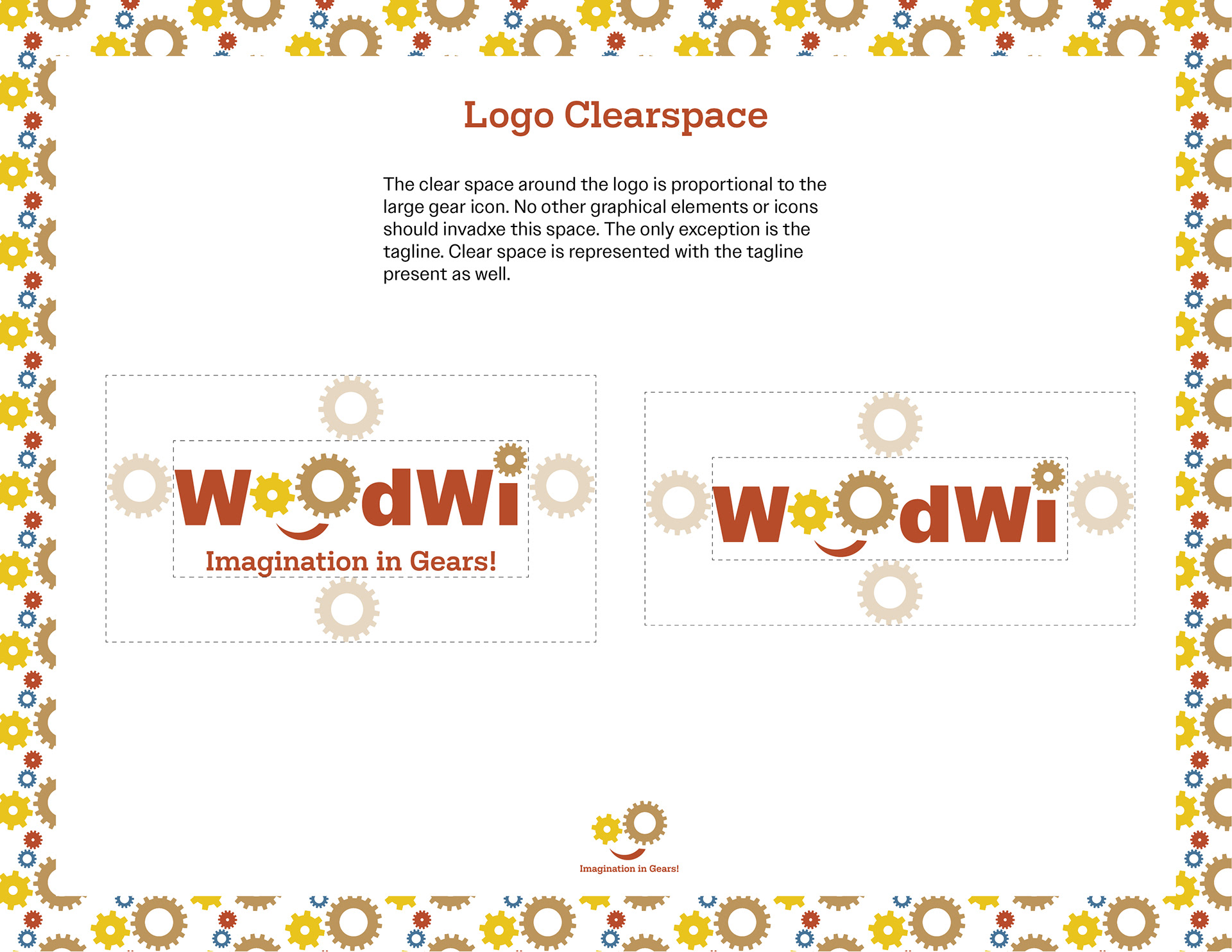
A brand style guide is an essential resource for designers, serving as a comprehensive toolbox for creating visually cohesive media assets. It provides detailed guidelines for the proper usage of the logo, ensuring consistent presentation across all platforms. The guide specifies a color palette featuring a range of approved hues that reflect the brand's identity and evoke the desired emotions. Additionally, it outlines the appropriate line quality to maintain a unified visual style. The brand story is also included, offering designers insight into the brand's mission and values. This crucial tool helps creators uphold brand integrity and maintain a consistent identity throughout their designs.

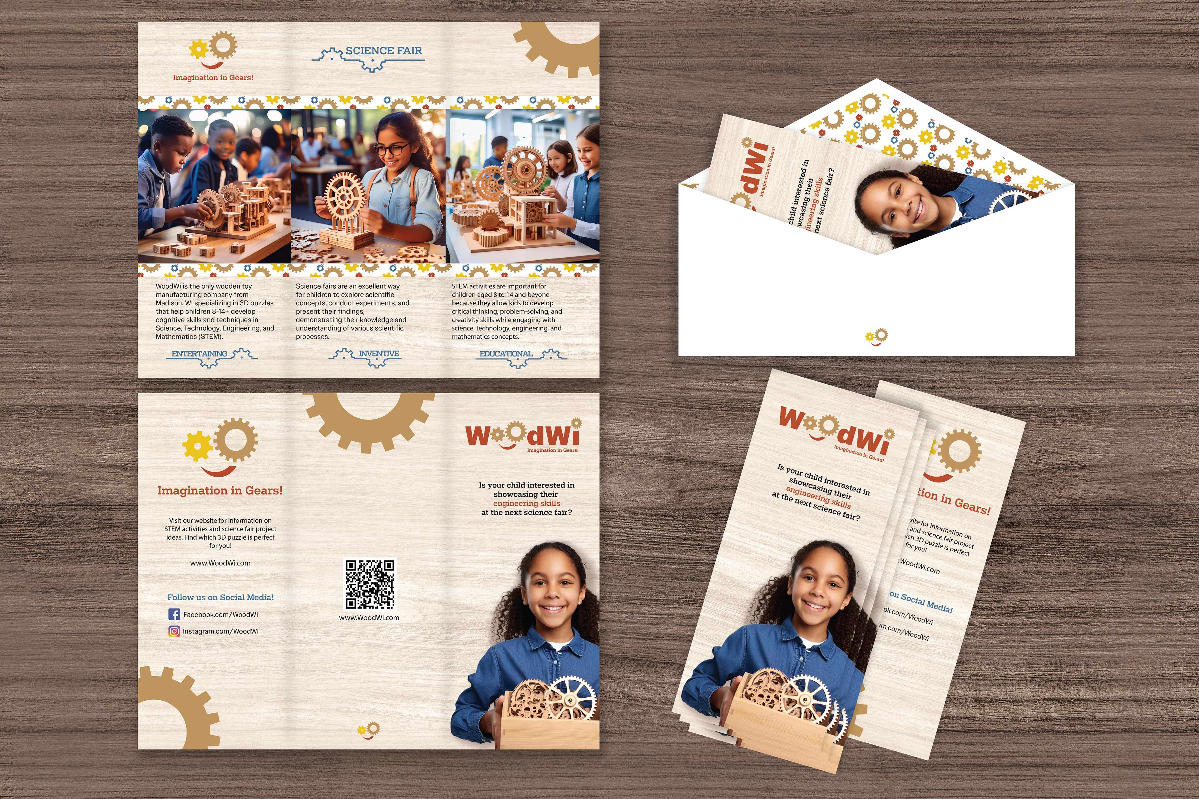
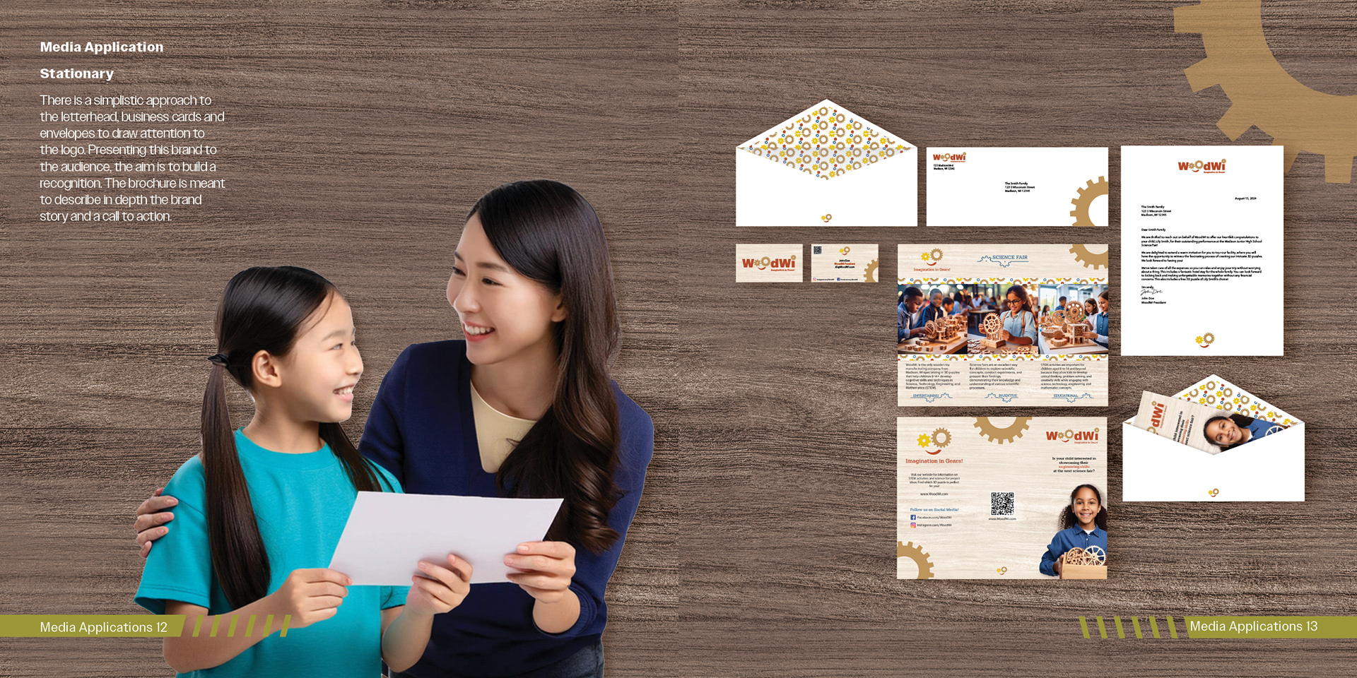
The vector drafts for the letterhead package have begun, incorporating imagery and graphic elements from the vision board to ensure brand consistency. The brochure needs improvement, as it feels chaotic and lacks structure, while the letterhead, business cards, and envelopes are designed simply to highlight the logo and enhance brand recognition.
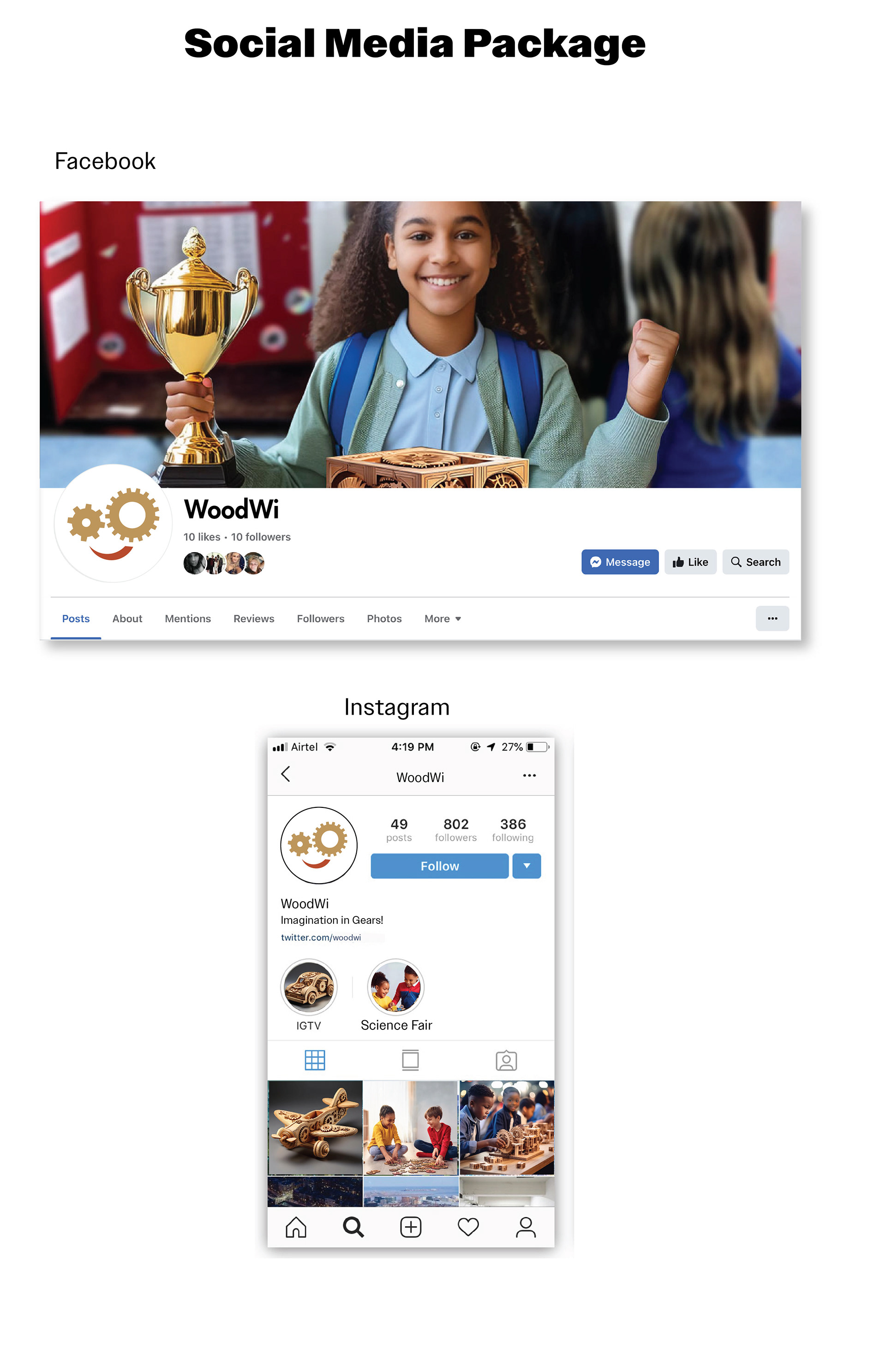
The social media draft features the icon logo as the profile photo and shows a science fair winner in the cover photo, reflecting the brand's theme. The aim is to build relationships with the audience, allowing for shared experiences and tutorials. Targeting school-aged children (8-14+ interested in early engineering skills), the social media platform will provide information on upcoming science fairs and encourage connections for support and learning.
Final Letterhead and Social Media Packages
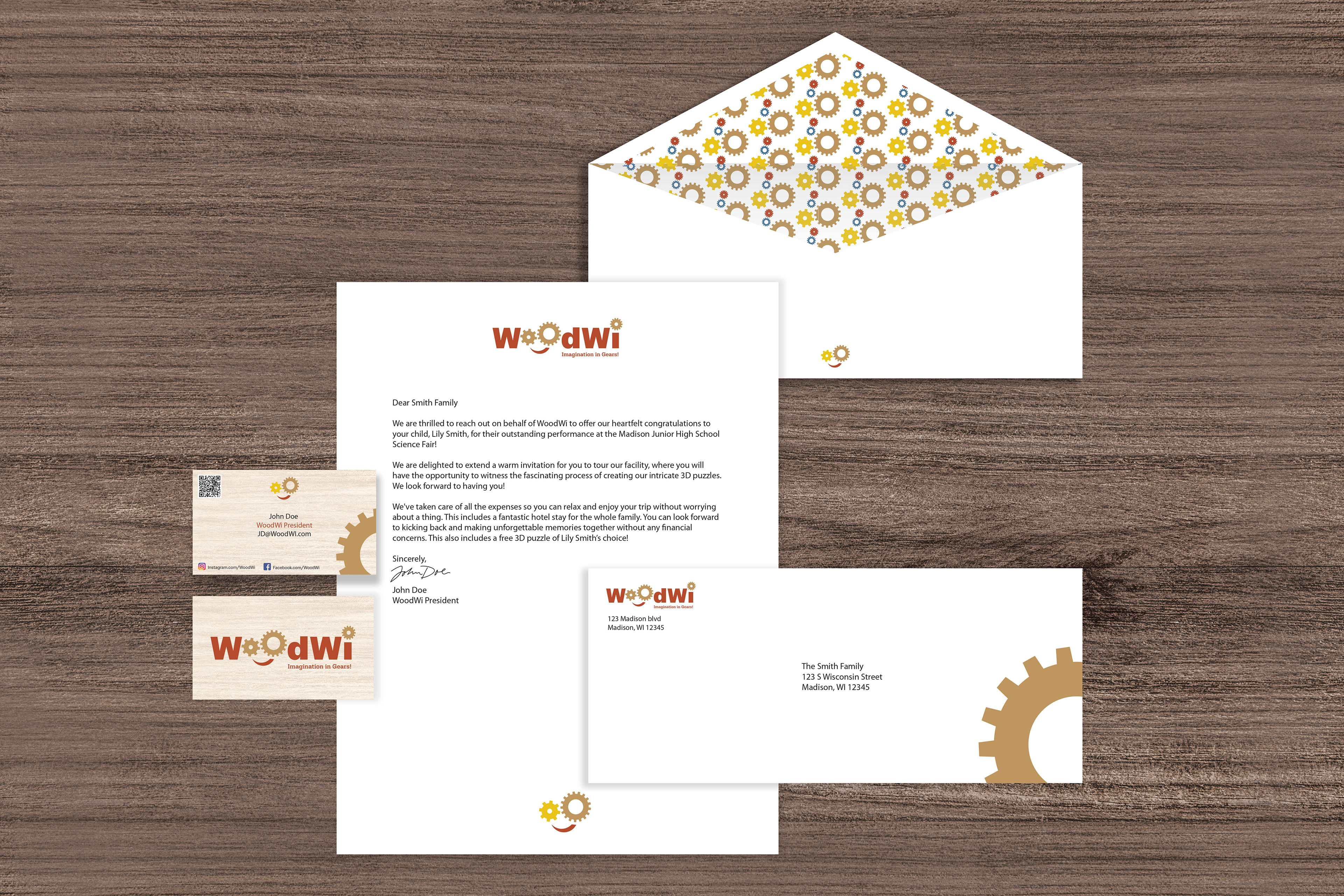
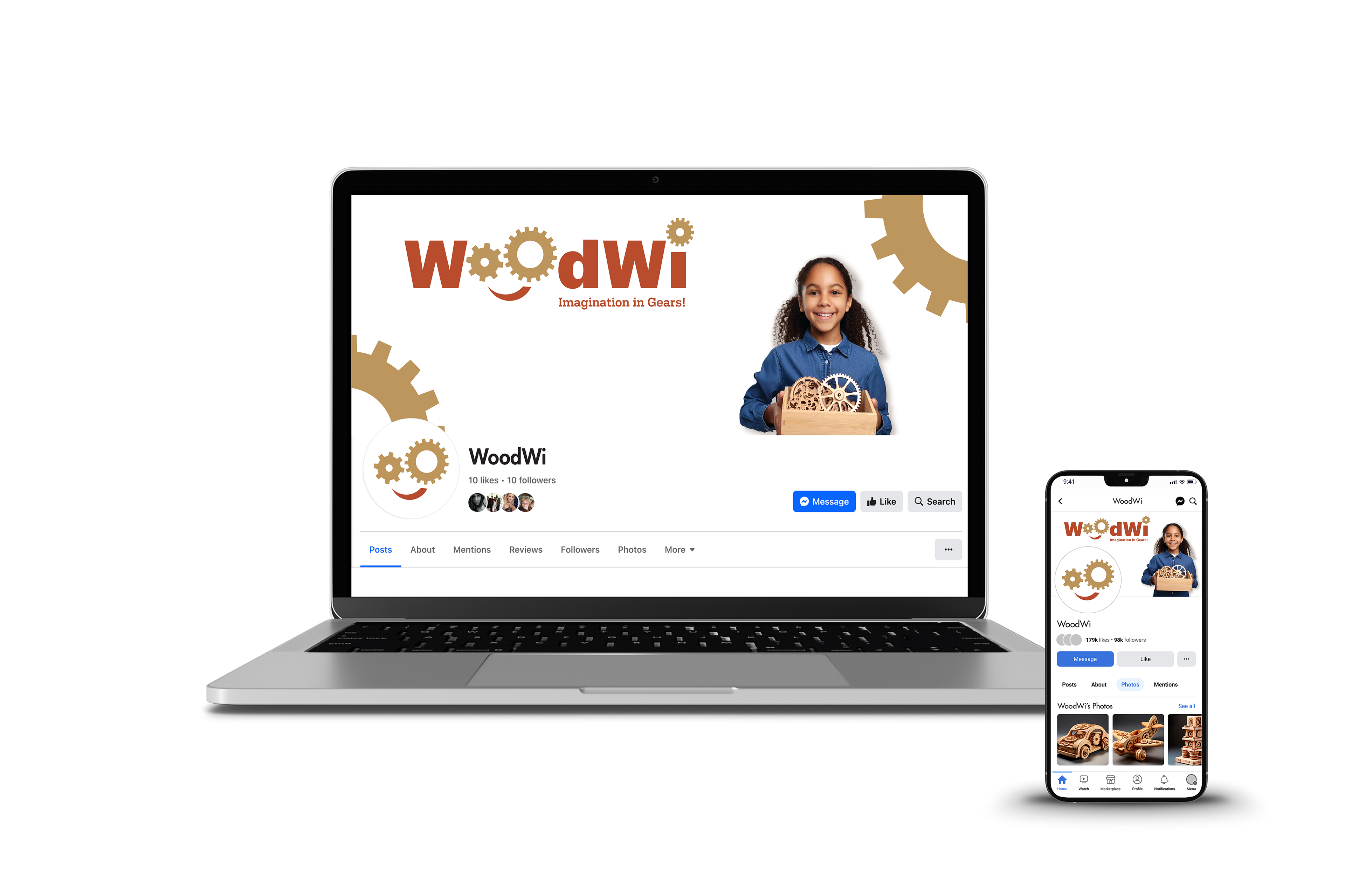
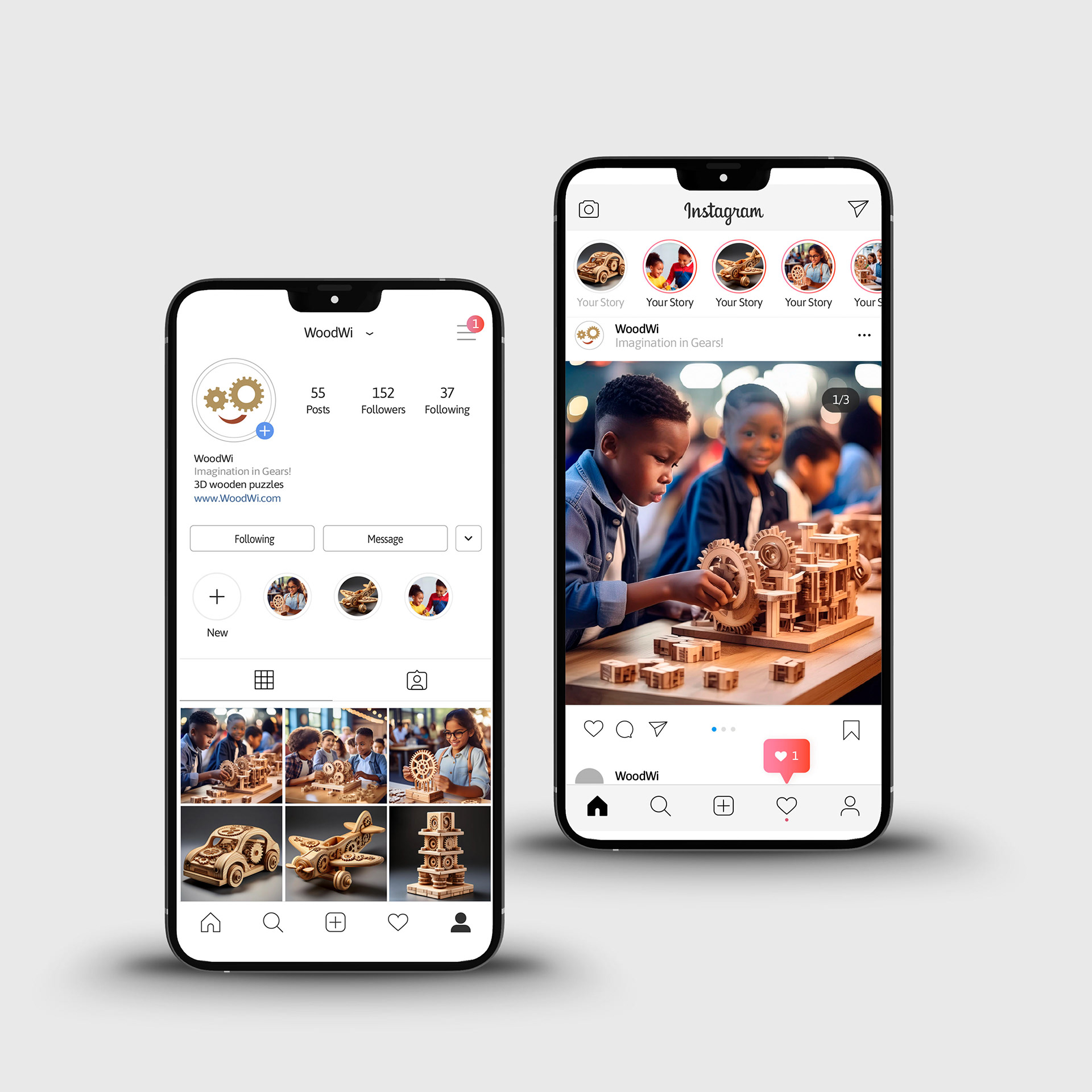
The design process started with creating a vector mockup of the letterhead and social media package. After a midweek discussion, the drafts were refined by adjusting the scaling and enhancing the imagery. Opting for short snippets of text instead of lengthy paragraphs. The imagery and graphics align with the brand's overall look and feel and the vision board. Given that this brand is preparing for launch, maintaining consistency is essential for building recognition and trust among the audience.
Swag, Bus Stop Poster, and Animation Drafts
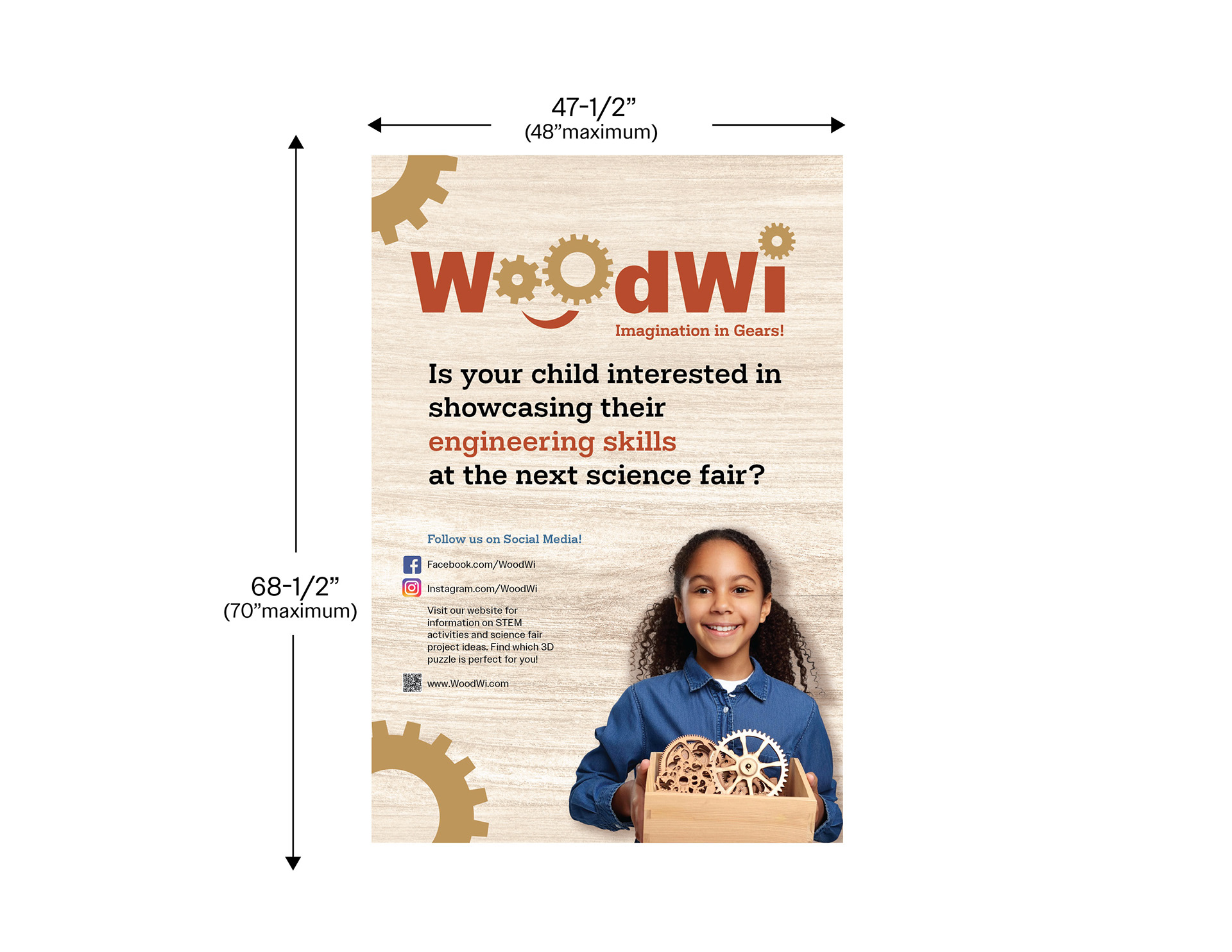

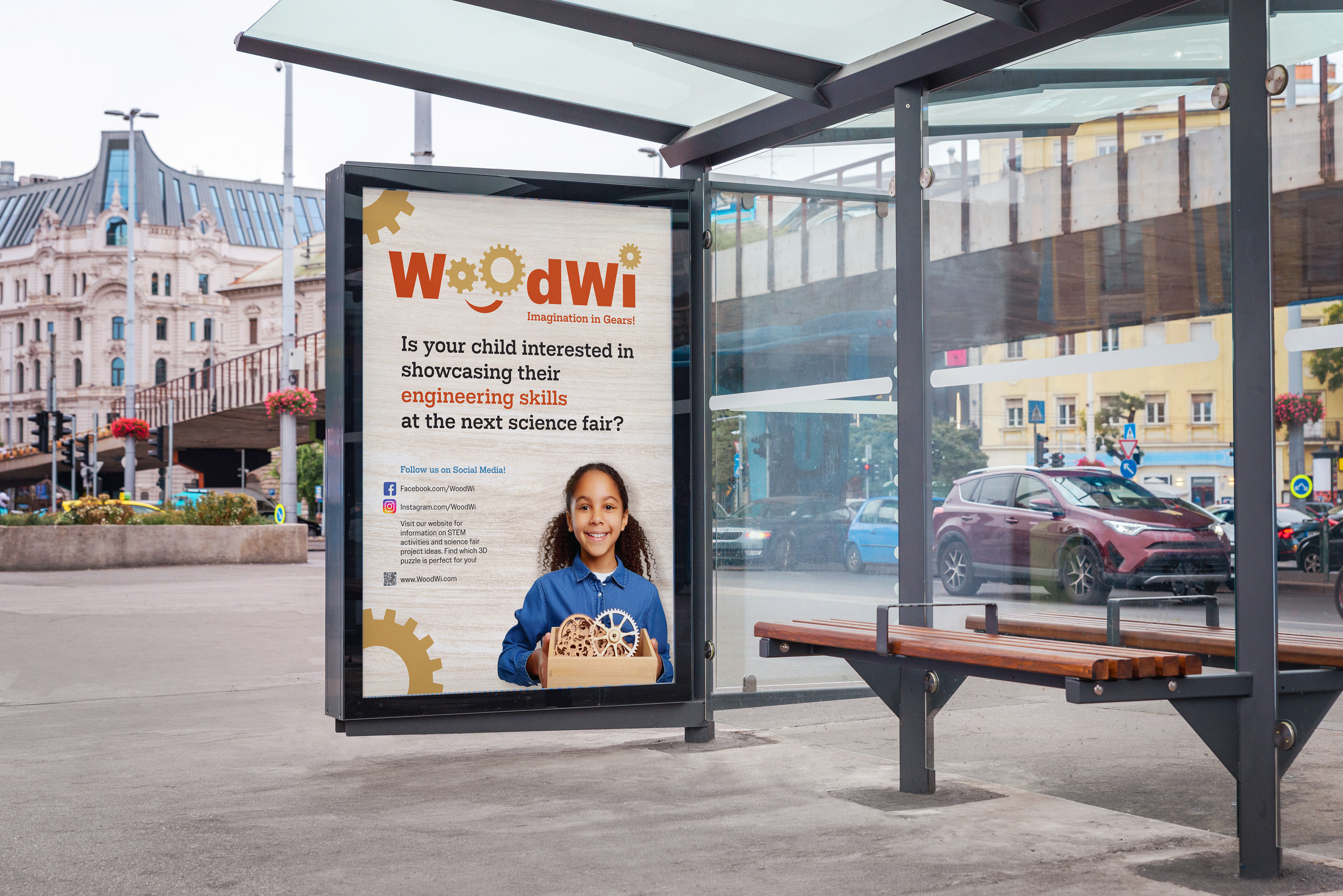
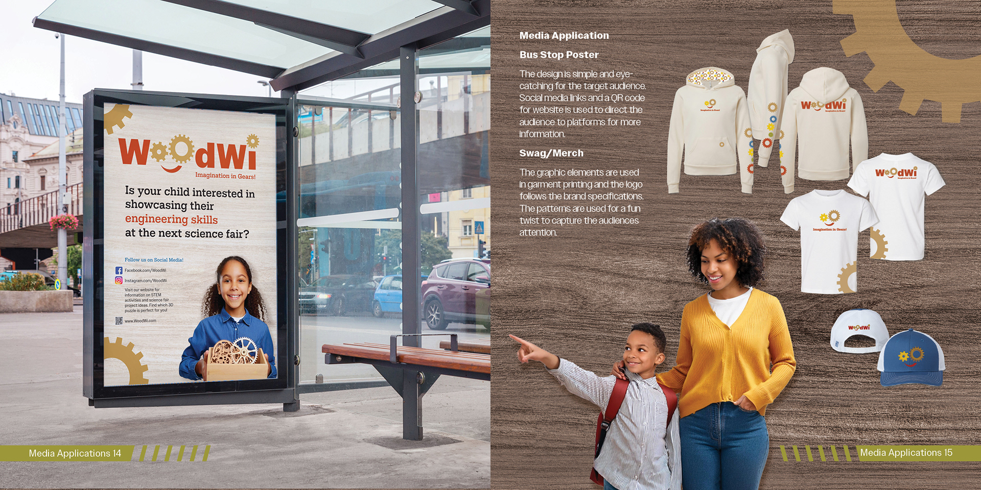
A design draft for the bus stop poster has been created, replicating the brochure while incorporating assets from the vision board and adhering to the specified sizing parameters. The design is simple and eye-catching, aimed at the target audience. It includes social media links and a QR code that directs viewers to the website for more information.
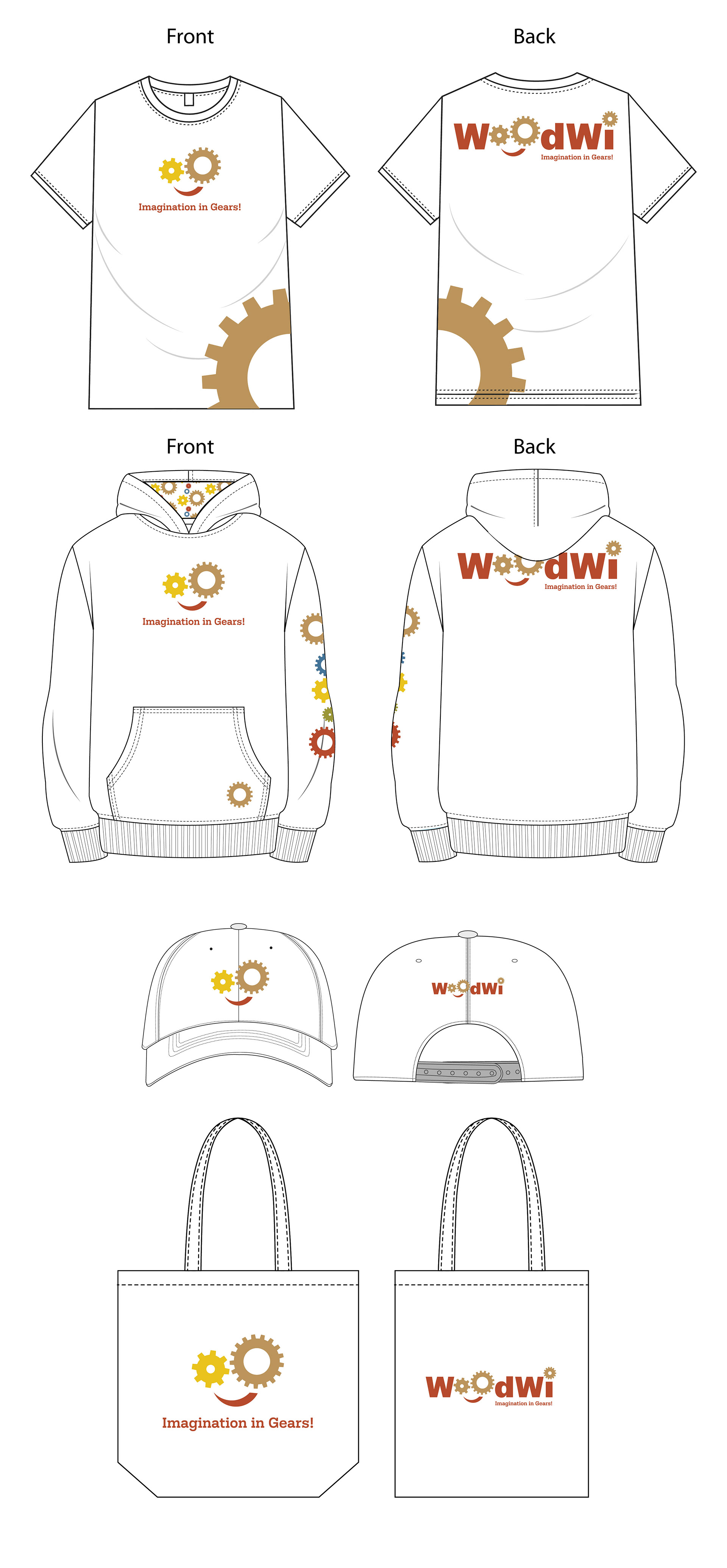
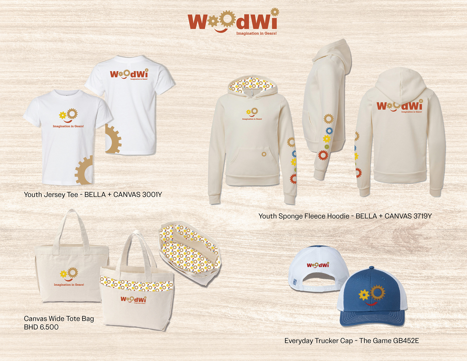
The locations and decoration methods for the swag merch are listed.
Tee- Center chest, left lower side (oversized), and full Back imprint locations. Screen printing decoration method.
Hoodie- Inside hood, center chest, front pocket, down the left sleeve, and full back locations. Screen printing and dye sublimation decoration methods.
Hat- Front and back. Embroidery decoration method.
Canvas bag- Front. 2 different styles, one location, and screen printing decoration method.
At the beginning of the animation, the gears will rotate on their own. The logo will gradually fade in until it is completely visible while the gears continue to rotate. Drafting is still underway, and there is a possibility that the entire logo will fade out at the end.
Final Bus Stop Poster, Swag and Animation
The development of these media assets focused on the brand story and the key message to communicate. This core message informed the design decisions and helped gain an understanding of the target audience. The animated logo featured turning gears, highlighting a central aspect of the brand, WoodWi, which sells fully operational wooden 3D puzzles without electronics.
Drawing from the brand vision board for the bus stop poster to maintain consistency with the brand narrative. Also, studying the principle of depth is an effective guide to conveying the brand message using the right voice and tone.

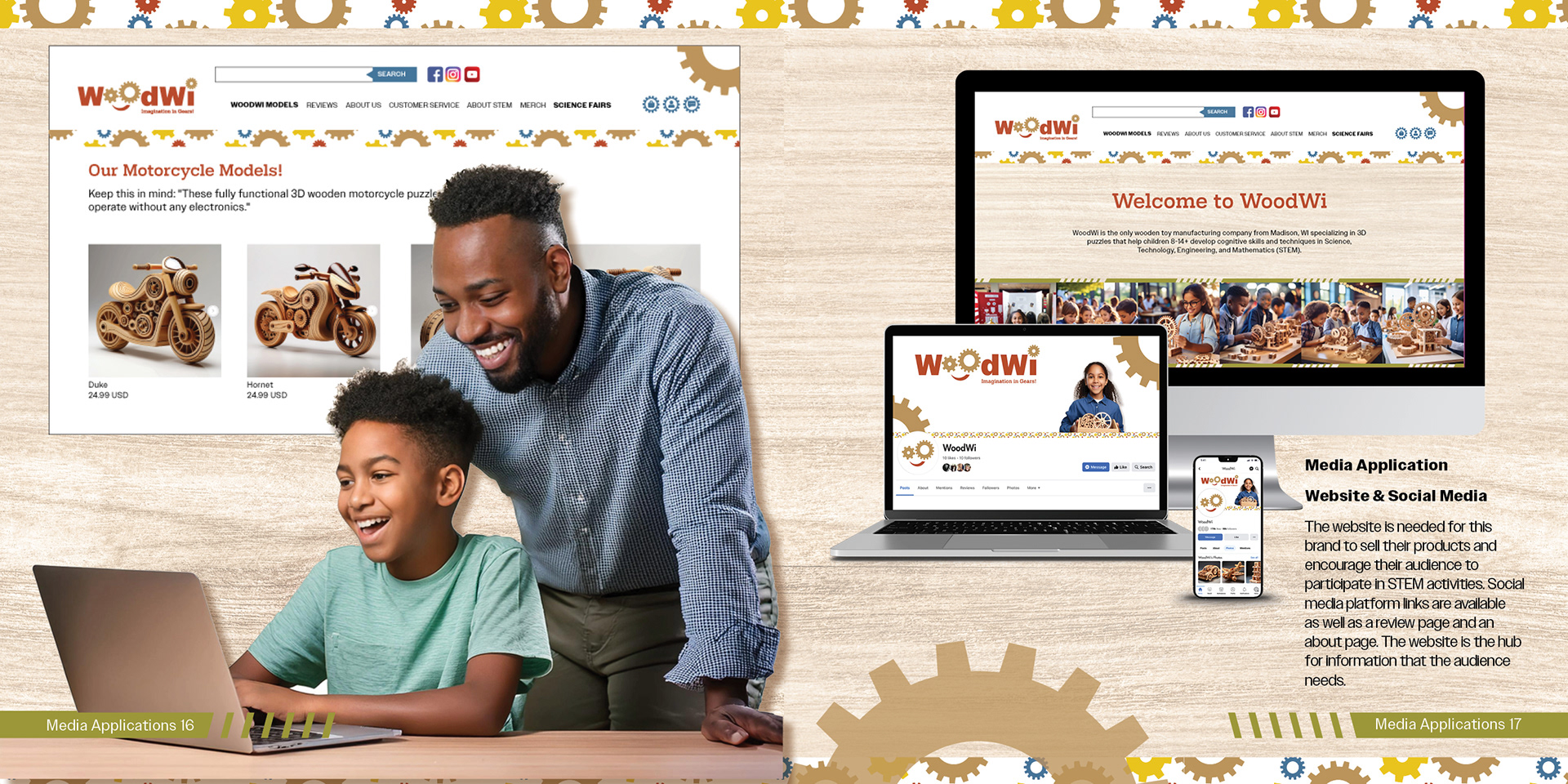
In researching websites similar to UGEARS that offer 3D wooden puzzles, the decision to implement a straightforward navigation design. The website will feature a refined list of 3D puzzles available for purchase, along with information related to STEM (Science, Technology, Engineering, and Mathematics).
Final Website Mock-up
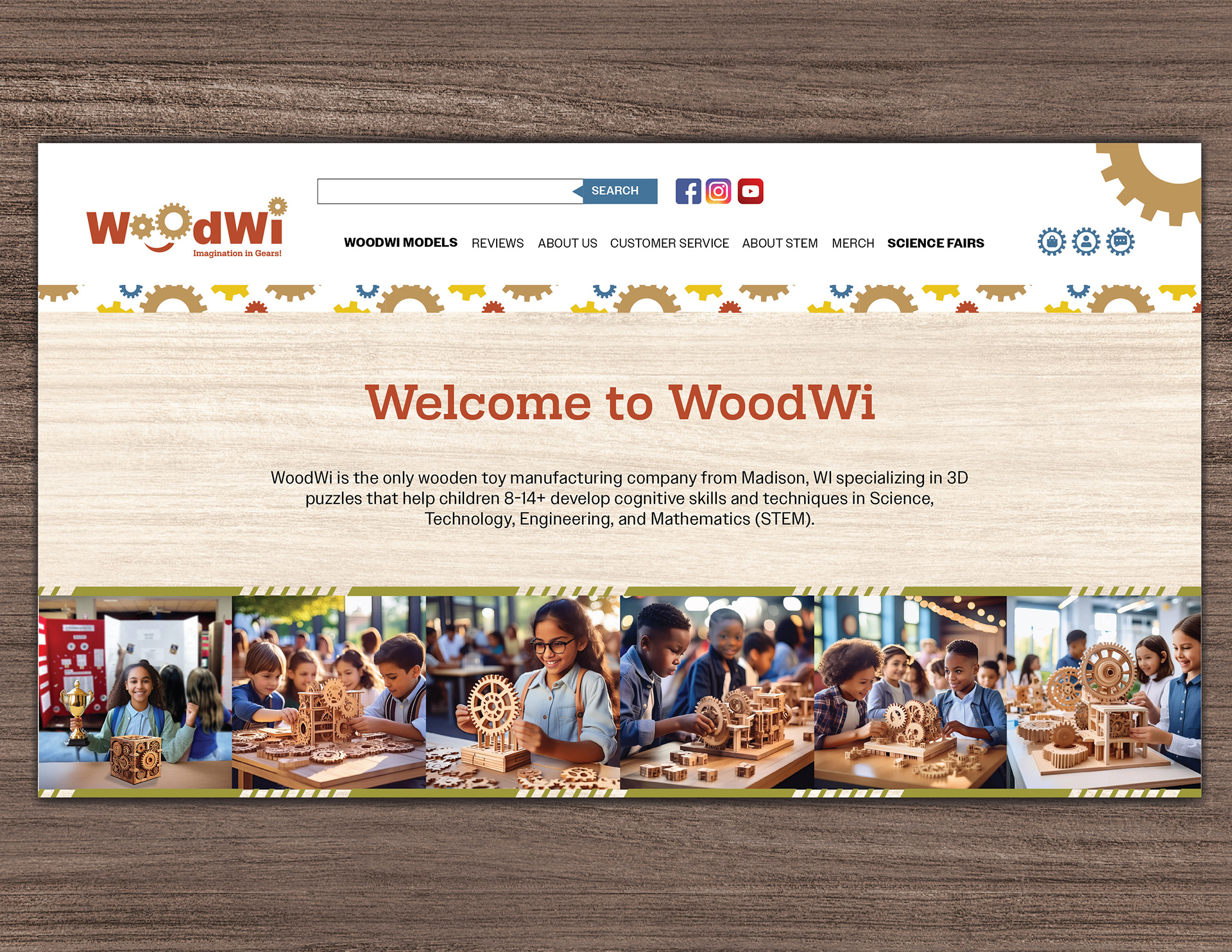

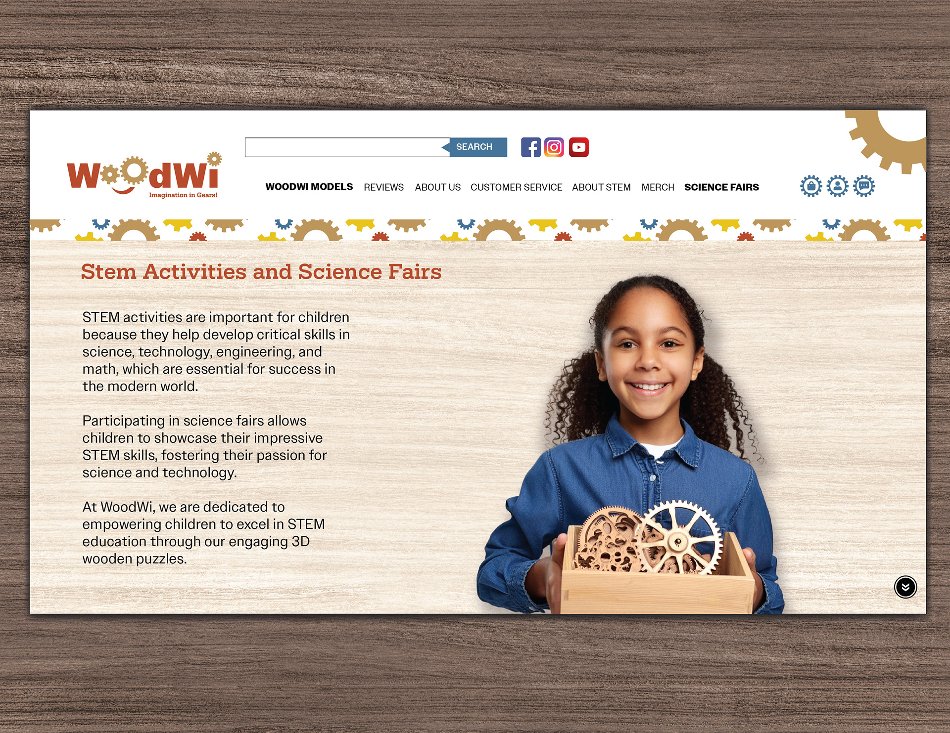
This website is essential for the brand, as it will facilitate product sales and encourage the audience to engage in STEM activities. It will also include links to social media platforms, a review page, and an about page. Overall, the website will serve as the central hub for all the information the audience needs.
30 Second Animation Clip
Brand Playbook
A brand playbook is essential for designers to use when persuading the audience that a product offers the benefits they need. It is crucial to conduct thorough research and experimentation before launching the product. The goal is to build trust with the target audience and fulfill the brand promise.